Pandora Design Systems: Web UI Kit
Released for Internal Use in 2019
PROBLEM
Previously, my design team used various Sketch files to document web flows, screens, and components, but there was no single source of truth for all web components specifically.
The goal of this project was to create a single library that would serve as the web UI kit for internal use by product designers. In order to do this, I needed to document all existing components present on the web platform across all 3 tiers (Pandora Free, Pandora Plus, and Pandora Premium) and take note of any inconsistencies within the product, to work toward a larger goal of overcoming design debt. For this project, I also needed to keep in mind the responsiveness of components to work across screen sizes, understandable naming conventions, and overriding functionality for scalability.
ROLE
As Lead Designer, I was responsible for component creation, library creation, consistent naming conventions, building in responsiveness to all components, any documentation, and hosting a workshop with my team to ensure usability and address any concerns.
TEAM
I worked with Sonia Macias (Product Operations Manager) and Sarah Rodriguez and Kelly Chang (mentors).
At the time, the Pandora Rhythm & Harmony Design kit only contained assets for Pandora’s mobile platform design system. It was split up into 2 files: Foundations (containing core global elements like color, type styles, and icons for mobile and web) and Components (containing commonly reused components like buttons, rows, headers, and more, but only for mobile).
The new web library I was creating would add another layer to the Components kit, allowing designers to focus more on ideating by eliminating the need to recreate components from scratch every single time. Not only would this be more efficient time-wise, but it would also remove any room for error.
When used properly, the kit would act as a single source of truth, serve as a robust resource into the how and why behind Pandora products, and allow designers to create the Pandora user experience and innovate more efficiently.
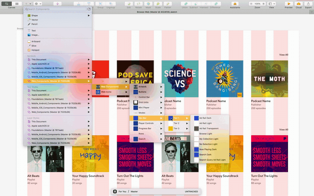
THE KIT ✨
After conducting a large scale audit across tiers, I added components as symbols to the web kit. The kit contained badges, buttons, control bars, grid units, mini players, modes UI, navigation bars, player controls, and rows, and their corresponding variations.
At the time, the design team used a file versioning and storage software called Abstract to create screens and flows for all feature areas. Abstract also housed the mobile UI kit. Thus, to maintain consistency in designers’ workflows, I added the web kit there, as well. Abstract mirrors Github in its capabilities to have master files and create multiple branches. In other words, this software allowed multiple designers to maintain and add to a single, ubiquitous design kit efficiently and while working on a variety of projects.
WEB KIT DEEP DIVE
All components were built to behave responsively to accommodate varying web screen sizes.
Naming conventions followed those of the mobile UI kit to maintain parity and ensure familiarity and efficiency for designers’ existing workflows. Components were named first by type of component, then tier, then elements present, and finally dark/light mode.
All components had certain override capabilities enabled for various elements within the component, to accommodate use cases for customization of metadata and imagery, where applicable.
THE HANDOFF
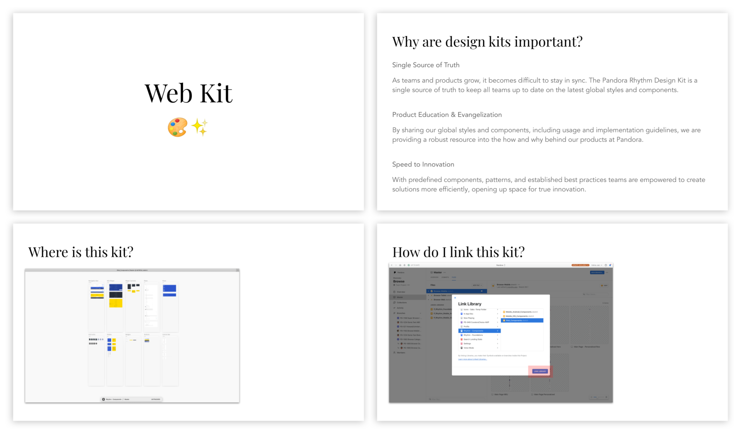
During the workshop with the rest of the Product Design team, I reiterated the importance of design kits as a single source of truth, my specific goals for the Web Kit, where this kit could be found, and how the kit could be linked to existing Sketch files. I also demonstrated how easy it was to drag and drop components into any screen a designer might be creating.
Because of the urgent need for such a library, the library went into use ASAP and is still currently in use today by a team of about 20 designers. It is a living, breathing kit that is constantly growing in size.
LESSONS LEARNT
Through this project, I learned many lessons, including that
Being in sync with existing workflows is important so as not to disrupt designers’ mental models and natural flows.
Design kits should be designed keeping scalability in mind - there is a constant influx of things that may be added to the kit (lots of design debt always).
After going through the creation of an entirely new design kit for newer projects, I realize there were a lot of things I didn’t include in the kit – grids, naming conventions that could work for both designers and engineer partners, smart containers, etc. There’s always room for improvement!