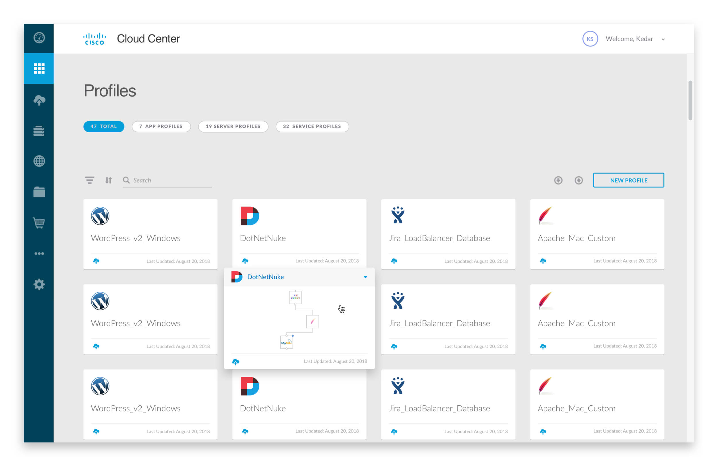
Cisco CloudCenter App Profiles Experience
Case Study • 2018
PROBLEM
The goal of this project was to understand painpoints within the App Profiles experience on Cisco CloudCenter, and streamline the UI to be inline with other products in its suite. Cisco CloudCenter is a multi-cloud management tool that allows users (primarily app architects) to manage and deploy various apps, regardless of their topology.
MY ROLE
I worked on this project independently with the guidance of my mentor and managers during my second 3-month internship at Cisco (May - August 2018). After conducting 3+ rounds of expert interviews to understand painpoints, I delivered a high fidelity prototype with a refreshed App Profiles experience. I used Sketch, InVision, and KeyNote.
TEAM
My managers were Kedar Shiroor and Cora Schoppe. My mentor was Kevin Johnson.
EXISTING FLOW
In order to fully understand what I was going to redesign, I understood the existing flow and people involved:
System Admins create customized services.
App Architects model apps using these services and out-of-the-box templates (this is the experience I refreshed).
Web apps are deployed.
RESEARCH
Because I was tackling the portion of the workflow relevant to app architects, I first researched app architect roles independently to understand their daily responsibilities and workflows.
Then, I conducted 3 rounds of expert interviews with 5 App Profiles stakeholders with backgrounds in engineering and sales. I asked questions about the different roles involved in the flow, the most frequent use cases + app topologies, and competitors.
I gathered the following key insights:
Most app architects did not use the pre-existing services that CloudCenter provided.
The blank canvas template was used 99% of the time, over 20+ others.
There were 3 commonly built topologies.
Many frustrations expressed were related to Services, which was outside of the scope of my project.
KEY FRUSTRATIONS
I categorized the key frustrations I learned through my research by role and by level of effort required from both a design and engineering perspective.
EXPLORATION & ITERATION
I then mapped each key frustration to the existing screens that were part of the flow, and brainstormed various possible solutions.
A visualization of where key frustrations were located on the existing App Modeler screen.
App Modeler Layout Option 1 (3 panel layout)
App Modeler Layout Option 2 (full screen)
I coupled each frustration with a medium-fidelity concept that could solve it. Because there were many frustrations uncovered through my research, I sought feedback for which to focus on.
Feedback indicated I should redesign the canvas experience and app profile and template selection flow.
There was not much room to move services onto canvas. The 3 panel layout could be expanded to take the full screen, allowing app architects to take advantage of more space.
Properties in the right hand panel were not organized. A possible solution was organizing them by order of usage by app architects.
There was no way to find a specific service without scrolling for a long time. A solution could entail implementing a service search.
There was no way to manage different iterations of app topologies. A possible solution could be implementing drafts to allow for version management.
The existing app profiles were stored in an unorganized fashion. A solution could be organizing them by what kind of app they were.
1 out of 20+ templates was used most frequently by app architects. To waste less of their time, a solution could be taking a user straight to that template or highlighting that one above others.
I then leveled up to higher fidelity mocks. My final deliverable was a high-fidelity clickable prototype. View the prototype here!
Below are before and after visuals to look at how the refreshed experience differed from the previous one.
The new designs were all based off of the user research I had done:
Instead of overwhelming users with 12+ templates, the new designs primarily highlighted the 3 most commonly used templates.
The new designs optimized the available space for building apps by giving users a full-screen canvas.
In the new designs, services and properties were organized in a way that is inline with architects’ task flow.
Components were updated to be consistent with the rest of the CloudCenter suite’s UI.
DESIGN SYSTEMS
I used an existing design system to refresh the App Profiles experience. I added in a few new components, collaborating with our visual designer Kevin Kuo, to ensure that they maintained consistency and parity with existing components.
LESSONS LEARNT
Interviewing stakeholders is no replacement for interviewing actual users of the product. In hindsight, I wish I had the ability to run my designs by actual app architects to validate my stakeholder research and designs. Due to limited resources during my internship, this was not possible, so interviewing stakeholders was a solution I came up with.
Brainstorming several low fidelity designs increases the likelihood of finding a solution that might work. Involving stakeholders at this stage helps narrow down low fidelity designs that benefit many stakeholders.
If I could do this over again, I would have gathered data on the existing designs like time for task completion and user satisfaction. I would then gather the same metrics using the new design, and compare the two sets of data to gauge success of the new designs.


